Improving the accessibility on our iOS client

Story
Lots of the UI of our iOS application is rendered through an internal framework called Ceramic. It’s a tool that allows us to stitch together collection views with different layouts while keeping it memory efficient and covering the usual meta tasks like logging, loading and error handling. It was first used in the New Releases page followed by lots of other features.
I was really excited to see that more and more parts of the app started to rely on this tool I started developing. Even after a few releases, it was fairly stable and issues were raised only every now and then.
It was great except for one important thing I failed to consider: accessibility.
As the usage of the framework increased, so did the number of error reports regarding accessibility. So one sprint, I challenged myself to make accessibility on this framework great.
I read everything I could find on Apple’s documentation regarding accessibility [1]. I searched for posts and books without finding much beyond the obvious, but the biggest insight came from the simplest experiment: by closing my eyes and trying to figure out the information in our app using VoiceOver.It was much more broken than I imagined and the bug reports could not describe how frustrating it was. Even worse was that even after the bug reports were ‘Solved’, the experience was still sub par because of two reasons (also common errors I found in other apps):
Readable text was too small to be touched.
It was hard to create a mental picture of the information presented. There were too many labels and they lack all the graphic aids that place them in a visual hierarchy.
The Technical Solution
The technical solution to the problem were surprisingly simple:
Simplify the readable interface by grouping its elements. This also makes them bigger and easier to explore.
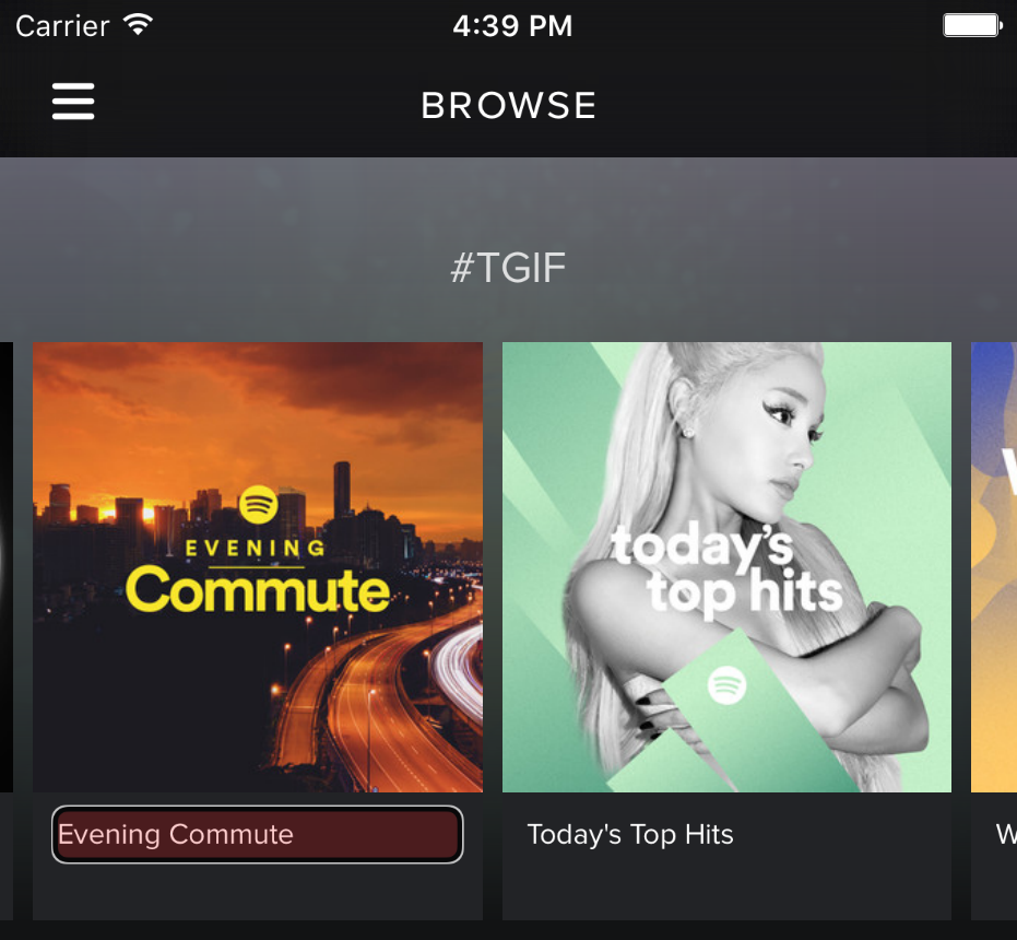
 Here, the readable area (the Evening Commute label) is barely touchable and the image of the item is invisible in Audio Touch
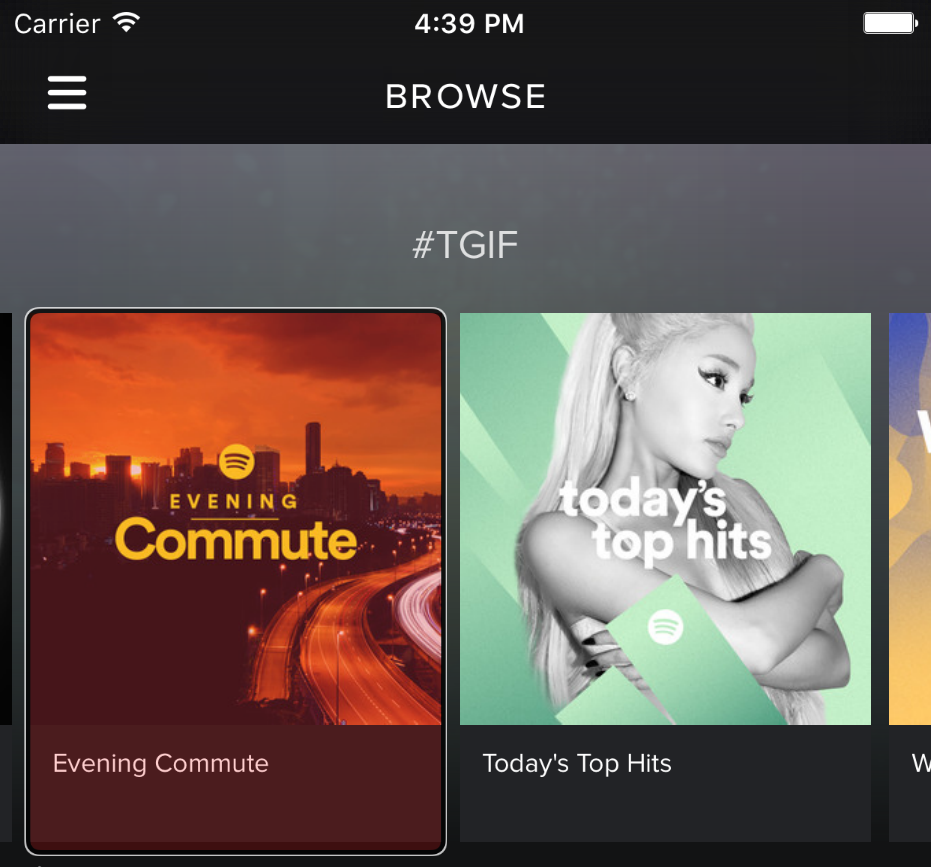
 Instead, we use the top element in the view hierarchy of the UICollectionViewCell to get a big accessibility element that is easier to read.
Ensure all the VoiceOver gestures worked correctly by transitioning from UITableViews to UICollectionViews. In complex view hierarchies, UITableViewCells prevented the accessible elements under it from being read.
Make use of accessibilityHint and accessibilityLabel properties in the UIViews that convey messages.
Next Steps
The technical solution is trivial itself, but the solution to this big challenge starts with awareness. Awareness that you as a developer, tester or designer, should consider accessibility as a permanent criteria of your artifacts and tests just like other criteria like security.
Once awareness has been raised, then it is possible to introduce accessibility formally into the design / development / testing processes, but in the meanwhile:
Include accessibility in your tests.
Ensure your implementations don’t make accessibility nearly impossible to implement later.
Ask yourself how accessibility will work while you are designing the Ui of your product.
[ 1 ] : Start with Accessibility Programming Guidelines for iOS and look for more resources here once you are done with it.
 Here, the readable area (the Evening Commute label) is barely touchable and the image of the item is invisible in Audio Touch
 Instead, we use the top element in the view hierarchy of the UICollectionViewCell to get a big accessibility element that is easier to read.


