Software Visualization — Challenge, Accepted

TL;DR Architectural diagrams are the bread and butter of software design and a foundational tool for communication and collaboration on software development. At Spotify, we have an incredibly complex network of thousands of interlinked software systems owned by hundreds of teams, so having a simple way to visualize these connections is essential. While capturing all of our software in one large diagram is technically possible, it would be very hard to understand and navigate. We need tools to look at our architecture at different abstraction levels in order to make good design decisions and evolve our software in a sustainable way.
As part of our solution, we leverage a standardized software metadata model to create a common language for communicating software architecture.
The Spotify System Model
To be able to reason and communicate around our complex software and the catalog, we’ve introduced a shared language and concept definitions — a system model. The Spotify System Model presents a set of core entities and abstractions we can use to synthesize data about our software health, ownership, and dependencies.
At Spotify, we believe that a solid shared understanding and terminology around software and resources empower communication and collaboration, which is essential to success for a company at our scale.
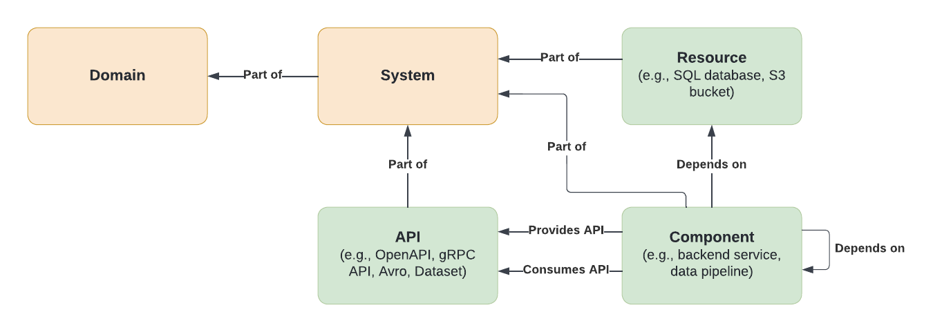
Our software is modeled using three core entities:
APIs: The boundaries between different components, defining the interface between those components
Components: Individual pieces of software (e.g., a backend service, website, data pipeline, library)
Resources: Infrastructure needed to operate a component at runtime (e.g., databases, virtual machines, storage buckets)

Figure 1. Relationship between core entities .
The ability to map and track software components in a catalog has been immensely valuable to us — it has allowed us to better understand the scale and development of our software. But as our catalog of individual components has grown in size, those components have become increasingly hard to understand, review, and put in relation to each other. For that reason, we’ve introduced a couple of additional abstractions that help us understand the broader software ecosystem:
Systems: Collections of entities that cooperate to perform some function
Domains: Entities and systems related to parts of the business
By expressing this model as metadata, we have been able to create a software catalog that keeps track of components, ownership, dependencies, and lifecycles in our ecosystem.

Figure 2. A domain and a system in relation to core entities .
Solving the software visualization challenge
Spotifiers love to use a whiteboard! Before we adopted Work From Anywhere, it was common to see whiteboards filled with “boxes and arrows” when walking around the office. And if you got curious and wanted to understand what was represented on a whiteboard, you would probably have to ask someone on the team sitting next to the board to explain the boxes and arrows to you. What do the boxes represent? Do they all mean the same thing? Do arrows indicate dependency or information flow? Whiteboard diagrams may look simple at a glance, but they can be hard to grasp without context or explanation.
Although diagrams on whiteboards may be adequate in smaller group settings, e.g., brainstorming sessions or mapping out existing system interactions in a meeting room, it’s not an approach that scales. It’s not practical to carry whiteboards around to spread knowledge, so they are constrained to a physical space. For a company with a distributed-first approach like Spotify has become, whiteboards aren’t always enough. Even though we transitioned our diagrams to digital tools, without conventions on how to visualize our software, the challenge remained. Software visualization is not a new problem, and there are many solutions out there — the most famous being the Unified Modeling Language (UML).
We needed a lightweight way to visualize software architecture, optimized for human-to-human communication. We wanted diagrams that would enable us to understand our software with minimal context. We looked at what our engineers were currently using and realized that the solution was right under our nose: the C4 model.
Leveraging the C4 model to create Spotify diagrams
The C4 model is a lightweight and straightforward approach to visualizing software architecture. Besides outlining a few abstractions, C4 defines a standard notation and best practices for drawing diagrams of software systems. Overall, it provides good guidelines to ensure that software diagrams are understandable and are able to stand alone without additional context. C4 strikes a good balance between ad hoc “boxes and arrows” and overly formal standards, fitting like a glove to our needs.
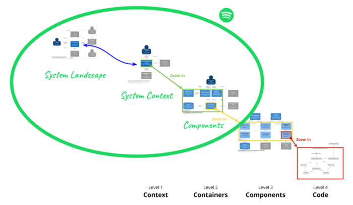
C4 comes with a collection of software abstractions. So how do we apply it alongside our own abstractions in the Spotify System Model? We don’t want to reinvent the wheel, so we kept C4 notation and best practices and replaced its abstraction layer with the Spotify System Model. Consequently, we had to redefine the set of core diagrams for documenting architecture and system design:
System landscape diagram: Describes a set of related systems, how they are connected, and what external systems they depend on — for example, all systems owned by a squad or all systems in a domain
System context diagram: describes how a system fits in the larger context of dependencies, dependents, and users
System components diagram: Describes how one system is built up from individual components (known as container diagram in C4)

Figure 3. Spotify diagrams compared to C4 diagrams, based on an image from c4model.com. C4model.com is owned by Simon Brown; for website licensing information click on the image
Automating architecture diagrams in Backstage
Having a catalog of our software, and details on its metadata and components, has allowed us to apply automatic rendering and interactive browsing of our software ecosystem in diagrams. This enables us to communicate and visualize our entire architecture using a common language and model.
One great benefit of automating architectural diagrams is that they will always stay up to date with the intentional design as expressed in metadata; there will be no need for updating these as the system evolves, and no questioning whether the visualization is outdated.
The extensible plugin system in Backstage has enabled us to easily add an Architecture tab, which renders a Spotify Component diagram of the system, to the system page. These diagrams are automatically generated using software metadata. External systems are linked from the diagram, enabling easy navigation between different system diagrams.
The benefits of C4
Having the system model available in Backstage has been very helpful for discovery purposes, understanding lifecycles, ownership, and relationships between software components, and automatically producing software visualization diagrams. The system model and its visualizations also allow us to produce system designs using a universal language — both for new systems and the evolution of existing ones — which has been helpful for communication and has enabled improved cross-team collaboration.
Additionally, visualizing software using C4 provides a high-level overview that can be used to generate insights about repeating patterns, tech debt, and other learnings. This has been highly valuable for onboarding purposes, both for new joiners on teams and external stakeholders. As automated diagrams allow us to traverse the ecosystem interactively, it also makes it easy to understand how systems interconnect.
Applying C4
If you struggle to understand your software because it’s too complex—visualizing it with diagrams can be a great help. Since having an abstraction model is crucial to understanding software architecture at scale, you can use an existing model, like C4 or the Spotify System Model, or create a model that is tailored to your specific needs. It is also essential to have a standard notation for software diagrams that ensures that they are comprehensible; the C4 model does a fantastic job and can work as inspiration if you don’t want to adopt it entirely. If you’re going to take the next step and automate diagram generation, make sure you capture metadata about your software and build your software catalog. Having such a catalog will also help you achieve insights and better plan how to operate and evolve your software.
Conclusion
As Spotify grows, so does the size and complexity of our software. We need tools to better understand and communicate our software, and having standard core entities and abstractions is foundational. By getting inspiration and utilizing the notation and best practices from the C4 model, we’ve been able to leverage the Spotify System Model to create software visualizations that are easy to understand with minimal context. This combination has created a shared language that is used across the organization to help with communication, aid decision-making, and support our software’s evolution. Come join us as we continue to evolve and find new solutions for complex challenges.


