What it Took to Scale Spotify’s Marketing Efforts

At Spotify, we’ve tried to uphold the tradition of running one major holiday marketing campaign at the end of each year. The campaigns typically run on various platforms such as the Spotify Homepage and the Premium page.
More recently, we wanted to run more campaigns throughout the year, perhaps during different holidays like Halloween or Easter. Rather than having one centralised team configuring campaigns across multiple markets, we wanted to create distributed teams local to each individual market responsible for tailoring campaigns to their respective audiences.
A bit of history
In the past, the Spotify website was a PHP monolith. As it began to grow, and the number of teams contributing to the repository grew, we occasionally found ourselves waiting on other teams with multiple pull requests blocked. Our Docker image to build the website took upwards of 30 minutes on developer machines and was slowing down, not speeding up, with the number of engineers.
When it came to running a holiday campaign at the end of the year, the responsible team was burdened with a massive amount of work. Each page was created from the ground up across multiple markets — all of which required different market nuances, translations, and imagery. The entire preparation process took up to three months of development work. By expanding into more and more markets, it soon became a full-time job just to prepare for one end-of-year campaign.
The creation of Campaign Admin
In a hack week bid to optimise some of our developer workflows, we built a rudimentary platform called Campaign Admin. This tool enabled developers to upload imagery to a GCS bucket, configure certain strings within the website and in-app pages, and ultimately request translations for each local market. It was a great solution for simple campaigns and massively optimised the process of creating some of the campaigns. We were able to hand off some of the tasks of creating campaigns to an in-house team, and the developers were able to concentrate on optimisations of the website and some of the tooling.
Unfortunately, more efficiency led to more scope creep. By the end of the life of the platform, an internal user could change the components, colours, text, CSS, and small bits of HTML — all from within the tool. All this additional complexity within the tool made it almost unwieldy for our teams in marketing and it became increasingly easier to introduce errors to the website. The time came for us to replace the Campaign Admin tool — we now knew we were not creating a tool for developers anymore, but for internal users on the marketing team itself. We needed a better user interface and experience, with more guardrails to prevent errors. We also wanted to enhance the tooling to be able to provide the next generation of campaigns for the company. Enter the Spotify Toolbelt.
The Spotify Toolbelt
Because we identified that the website was slowing developers down, an initiative was underway to split the website into ‘verticals’. Each vertical was to be highly specific to a small part of the website and owned by a single team. The marketing pages section was one of the first verticals split from the original website monolith.

Example of the routing layer with each vertical owned by separate teams.
The marketing vertical was a Node.js Express app, which was server-side rendering our in-house library of landing page React components.
A powerful data source
The data source for the marketing vertical was the first ‘tool’ built for the Spotify Toolbelt, aptly named Scheduler-API. Taking our learnings from Campaign Admin, we took our time designing the Scheduler-API, taking into account key feature requests including the ability to edit any component on the website or in-app pages — and to not be required to configure the same content for each different market multiple times.
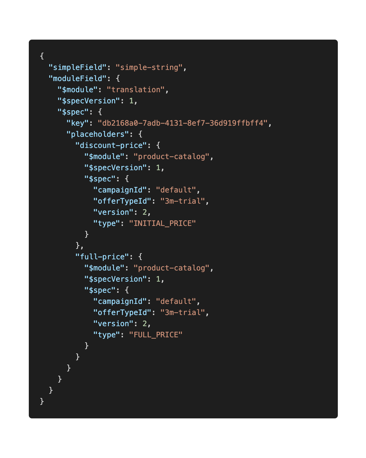
We came up with the concept of blueprints. Each blueprint would define a page, and these blueprints could be expanded into different markets. The next image is an example blueprint including modules for translations—these modules have placeholders such as the pricing for the offers to be displayed to the end external user.

Example of the JSON blueprint with modules to be expanded.
Different modules could be added to each blueprint. The most commonly used blueprint module is the translation module. This enables strings to be embedded into the blueprint and then, during runtime, the corresponding string can be matched within our translation system for the appropriate market. These strings can also have other bits of data inserted, such as the user name, offer details, etc.
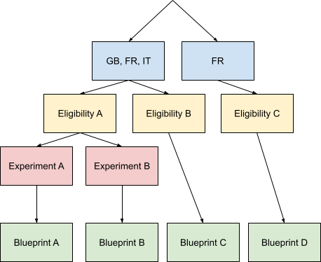
In hand with our blueprints, we had to come up with a targeting system to determine which external users should be able to see which pages. To solve this issue, we came up with the decision tree depicted below.

Example of the decision tree serving different content to the right user.
The decision tree helps us decide which blueprint is best to serve to an external user depending on multiple factors (e.g., current market, offer eligibility, the device they’re currently using, or even the user’s current favourite artist).
A great internal user experience
We knew from Campaign Admin that having random text boxes — which internal users were required to remember and then enter the variable names themselves — was not going to be a scalable solution. We also had the problem of wanting to create a great user experience, but we had a lot of different pages and components which could be configured. This problem was also exacerbated when we factored in that we’d need different user experiences for all our different external surfaces.
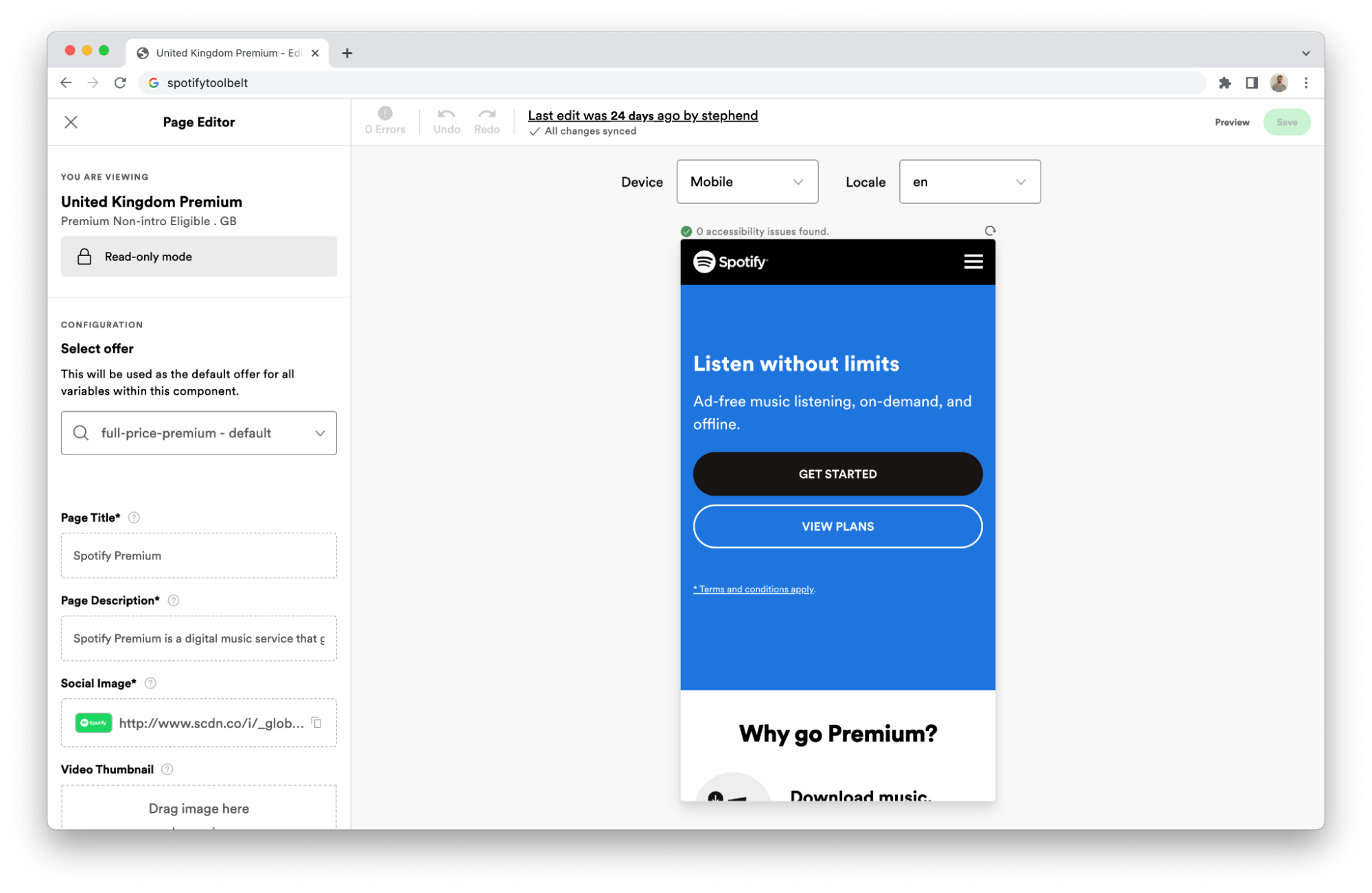
To solve the issue of requiring different experiences for different surfaces, we created the editor — a reusable React component which could take a JSON schema and create a blueprint for the Scheduler-API.

Example of the editing experience for the Premium page.
Each team that now wants to integrate with the Scheduler-API only needs to write a simple JSON schema defining how they’d like their data to be shaped, and voilà! A new editor experience is created uniquely for them.
For the blueprint referenced in the earlier section, the schema would be:
{
  "simpleField": { "type": "string" },
  "moduleField": { "type": "translation" }
}
This simple schema can be expanded to describe fairly complex fields. All of the components on our web pages and some in-app pages have been described by this schema.
Each integrating team can use their JSON schema differently; one team now uses their schema to generate their TypeScript types, ensuring we never have the issue of inconsistent variables — something we’ve occasionally seen in the past.
With the editor, internal users are able to enter components, strings, imagery, and colours in a WYSIWYG manner, adding guardrails that never existed within the old tooling. Once internal users are happy with the content they have created, they can submit the content for translation and the tooling will coordinate with various APIs to create translations and notify internal users when they are complete. When pages are ready to go live, they go through an approval process and will then go out to customers.
The road not yet travelled
Whilst our campaigns have come a long way at Spotify, there is still a lot to be done. The time it takes to configure some of our larger campaigns has dramatically decreased, whilst the number of configurations required (markets, targeting, etc.) has increased. We’ve been able to increase the amount of campaigns we can deliver to our Spotify users while simultaneously handing over some of the operations to the local marketing teams.
Though we’ve achieved some of our main goals, we’re still working hard to implement new features to make our tooling more accessible and user friendly, and we’re still keeping an eye to the future and planning for the upcoming generations of campaigns. If you’d be interested in joining the band and helping us scale out the future of campaigns at Spotify, there are currently open opportunities within the team for frontend and backend developers!


