How to Accurately Test Significance with Difference in Difference Models
When we want to determine the causal effect of a product or business change at Spotify, A/B testing is the gold standard. However, in some cases, it’s not possible to run A/B tests. For example, when the intervention is an exogenous shock we can’t control, such as the COVID pandemic. Or when using experimental control is infeasible, such as during the annual delivery of Spotify Wrapped. In these cases, we can demonstrate cause and effect using causal inference techniques for observational data. One common technique we use for time series data is difference-in-differences (DID), which is easy to understand and implement. However, drawing good conclusions from this method with significance testing is more complex in the presence of autocorrelation, which is common in time series data. There are numerous solutions for this issue, each with strengths and weaknesses.
We briefly describe the difference-in-differences method and cover three approaches to significance testing that appropriately handle time series data — averaging, clustering, and permutation — along with some rules of thumb for when to use them. The results of our simulation tests show that permutation testing gives the best balance between power and false positives for datasets with small numbers of time series units and that the clustered standard error approach is superior for larger datasets. Averaging is broadly protective of false positives but at a great cost to statistical power.
Difference-in-differences
Suppose we want to increase podcast listening, so we spend marketing dollars promoting a particular show. We’d like to ascertain the impact of the spend on show listening, but we can’t run an A/B test because we don’t have a way of controlling whether off-platform marketing reaches only our treatment group and not our control group. We could look instead at the difference in listening after versus before the marketing campaign. However, show listening might increase or decrease over time for lots of reasons unrelated to our marketing efforts (e.g., platform growth, user engagement seasonality, episode releases, etc.), so a simple post-intervention/pre-intervention difference could be misleading.
To correctly understand our marketing effect, we could employ the popular causal inference technique for time series data called difference-in-differences, or DID. Here we use DID to control for factors unrelated to marketing by utilizing time series data for another show, which was measured at the same time points but had no marketing campaign. The idea is that this control time series should exhibit the same trends in listening as the time series for the show we marketed — except for the trends caused by our marketing efforts. It estimates what would have happened to our marketed show if we had not run the campaign and lets us subtract all the other effects from the treated show, leaving only our marketing effect.
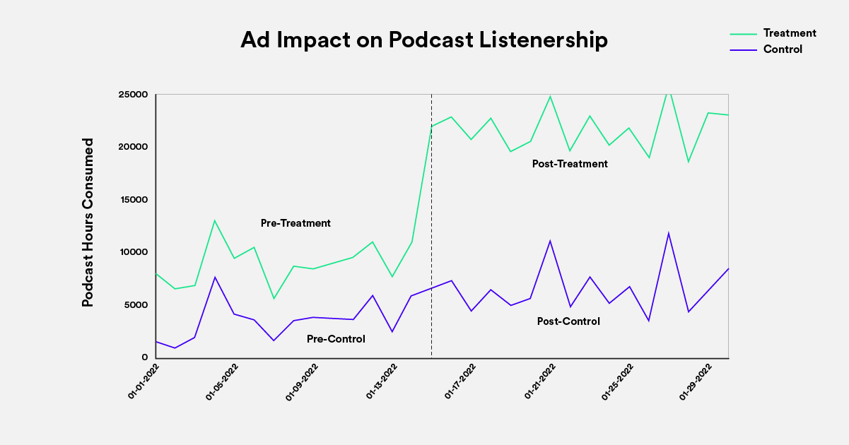
To do this, we take two differences. First, we subtract the listening data before the marketing intervention from the data after the intervention. We do this for both treatment and control. The treatment difference contains our marketing effect and other effects, which we’re not interested in. The control difference contains only those effects of no interest. Second, we subtract these two differences, removing the impact of the factors we’re not interested in and isolating the causal effect of our marketing efforts (Figure 1).

Figure 1: The blue line represents the treatment time series and the red line the control time series. Because the two time series show parallel trends before the intervention (vertical dashed line), the control time series provides a good guess for what would have happened to the treatment time series if there had been no intervention. Listening hours increase for both time series after the intervention, but the increase is larger for the treatment time series. The difference-in-differences (post-treatment minus pre-treatment) minus (post-control minus pre-control) estimates the causal effect of the intervention by subtracting away trends of no interest.
Data above is for illustrative purposes only.
Estimating DID
DID is typically estimated with a linear model of the form:
Y = B0 + B1 * IsTreatment + B2 * IsPost + B3 * IsTreatment * IsPost + e
Where B0 is the coefficient for intercept, IsTreatment is an indicator (0 or 1) for the treatment time series, IsPost is an indicator for the pre- and post-intervention time points, and the interaction IsTreatment * IsPost codes for the difference-in-differences we’re interested in, which is estimated by B3.
This kind of linear model is convenient to use, can readily handle multiple treatment and/or control time series (or units), and can be expanded to include nuisance covariates. When fitted via standard statistical software, the output also features a standard error and p-value estimate to understand the significance of the DID result. However, typical solutions like ordinary least squares (OLS) will often get the significance test wrong and should not be trusted.
Autocorrelation causes unreliable standard errors and significance tests
DID estimates are made using time series data in which the observations are not independent, but tend to be correlated with one another. This autocorrelation distorts standard-error estimates when they are computed in the usual way and can lead to inaccurate significance tests and bad decisions.
How does autocorrelation cause this problem? Imagine generating a dataset where each subsequent observation is created by taking the last observation and adding some random noise to it. In this random walk time series, the data are positively autocorrelated: the data points near one another in time tend to be similar to one another (this can be observed quantitatively by correlating the series with a lagged copy of itself, and through tests such as the Durbin Watson). This is problematic because each data point is partly explained by those preceding it, so the amount of information contained in the data is smaller than what a count of the number of observations would suggest. Statistical power grows with sample size, but it grows more slowly for these positively autocorrelated data because the observations aren’t communicating totally independent information. As a result, standard statistical software routines are overconfident when estimating standard errors and declare significance too liberally.
Time series data may also be negatively autocorrelated, where data points differ systematically from one time lag to another. Negative autocorrelation has the opposite effect of positive autocorrelation on standard errors. It creates underconfidence, with standard errors that are too big and significance tests that are too conservative. Autocorrelation of any kind can be pernicious to good data-based decision-making. While we encounter both sorts in the data we work with, we observe positive autocorrelation more commonly, so we focus on it in the simulations described below. The remedies we explore, however, are broadly applicable, regardless of the sign of the autocorrelation.
We examined this problem by creating artificial time series with positive autocorrelation, fitting DID models, and analyzing the significance test results. Importantly, we added no causal effect to the “treatment” time series in these simulations (half of the simulated time series units were labeled as treatment).
If the standard errors were correctly estimated at the significance level we used (alpha=0.05), we’d expect to detect significance at a 5% rate (false positive rate), despite no added treatment effect. However, due to the autocorrelation in our data, the false positive rate was over 30% (Figure 2), over five times too high!

Figure 2: The x-axis is the number of time series units we generated per DID model, and the y-axis displays the false positive rate. Using the out-of-the-box standard errors that accompany linear regression model output leads to substantially more false positives than expected.
Data above is for illustrative purposes only.
How can we accurately estimate significance?
A false positive rate of over 30% is far too high to rely on this technique to make good product and business decisions. Fortunately, numerous methods have been proposed to correctly estimate significance with autocorrelated data. We tested three approaches that appear frequently in the literature — averaging, clustering, and permutation — and examined their relative pros and cons.
Averaging
The simplest approach we used to remove autocorrelation was averaging. With averaging, we escape the autocorrelation problem by taking the mean of each time series unit before and after the intervention. For each unit in an analysis, this produces a single pre- and post-intervention data point (Figure 3). Because the data are now essentially no longer a time series, the autocorrelation problem is eliminated.

Figure 3: The table on the left shows data before averaging. The time series unit A has four measurements at four different points in time. The first two, labeled as 0, are pre-intervention and the last two are post-intervention. By averaging the pre- and post-intervention points, we condense the data into the table on the right-hand side.
Data above is for illustrative purposes only.
Ordinary methods for computing standard errors and significance testing can be used on averaged data without issue. We tested this method with our simulated data and found the false positive rate fell into the expected range (5%, Figure 4). However, by averaging, we’re often dramatically reducing the size of our data and therefore, our power to find a significant result.

Figure 4: The x-axis is the number of time series units we generated per DID model, and the y-axis displays the false positive rate for the averaging solution to autocorrelation. The averaging method results in false positive rates in the expected quantity.
Data above is for illustrative purposes only.
Clustered standard errors
Unlike averaging, the clustered-standard-errors approach makes use of the full dataset. It’s also easy to estimate using common statistical packages. You just need to tell the software what your clusters are.
But what is a cluster? It’s really just another name for the time series unit we discussed above. When defining a cluster, we want to group correlated data into the same cluster. So typically, in time series analysis, each time series becomes its own cluster.
For example, my usage of Spotify today is correlated with my usage tomorrow. But rather than treating each day as an independent measurement, the measurements should be grouped into a cluster because they are correlated. Similarly, your usage data are correlated over time and should be grouped into a cluster. Your data and my data are not likely correlated, so they should be grouped into different clusters.
These clusters can be used to help us correctly estimate statistical significance. Typically, the details on how this works are explained via the linear algebra used to compute the specialized variance-covariance matrices that solve the problem of correlated data. Here, we just give the intuition for how clustered standard errors work, and refer the interested reader to Cameron and Miller (2015) for more details.
When we model our clustered data, we typically assume that they are correlated within clusters but not across them — though there are cases where more sophisticated correlation structures are applicable, e.g., Ferman (2002). Common statistical software routines for linear models like OLS assume zero correlation everywhere, which is what gets us into trouble with significance testing. With the clustered approach, we estimate the correlations within the clusters using the model residuals. These residual errors are then used to compute the standard error of our estimated effect, which we subsequently use for significance testing. Because the within-cluster correlation has been directly incorporated into the standard-error estimate, larger positive autocorrelation in the data will result in larger standard-error estimates (rather than the smaller ones we’d see from standard statistical software model output). This protects us from the increase in false positives we’d expect in our positively autocorrelated time series data (see Figure 2).
To demonstrate how increased positive autocorrelation relates to larger standard errors (and therefore fewer false positives) using the clustered approach, we simulated time series data with different amounts of within-cluster autocorrelation. We then fit DID models with clustered standard errors to these data and recorded the residuals and standard errors. Figure 5 shows that the approach works as advertised: as positive autocorrelation increases, so too does residual error and therefore standard error (plotted as 95% confidence intervals for visualization purposes).

Figure 5: The relationship between strength of autocorrelation, the magnitude of residuals, and the size of confidence interval. Plot reflects statistics from DID models fit to simulated random walks with varying amounts of lag-one autocorrelation.
Data above is for illustrative purposes only.
It’s important to note that the theory behind clustered standard errors says that this method will converge to the true standard error as the number of clusters goes to infinity. In practice, this means if we have too few clusters, the standard errors and thus model inference will be incorrect. We explored this with simulated time series and found that the false positive rate was quite high when we had few clusters (Figure 6), but it fell into the expected range as the number of clusters/units grew.

Figure 6: The x-axis is the number of time series units we generated per DID model, and the y-axis displays the false positive rate. Using clustered standard errors leads to substantially more false positives than expected when we have few units, but the false positives reduce to the expected 5% as the number of units increases.
Data above is for illustrative purposes only.
Permutation testing
Permutation testing doesn’t deal with the autocorrelation issue directly like the clustering approach but instead renders it harmless by comparing the relative rarity of the observed results to those that could have been observed with the autocorrelated data.
Let’s walk through the permutation testing procedure. First, we model our data to get the DID estimate. Next, we subtract the treatment effect from the treated time series for the time periods when the treatment was in effect. Then, we randomly shuffle the “treatment” and “control” labels for the time series units, allowing “treatment” to become “control” and vice versa, and use DID to estimate the causal effect of the “treatment”. We repeat this shuffling and estimating process thousands of times, recording the DID point estimate each time. This procedure gives us a sampling distribution of DID effects we could have observed if our intervention of interest had no effect on the treated time series units. This distribution can be used to understand the significance of the observed effect: its location in the distribution indicates the p-value (Figure 7).
We examined permutation testing with simulated time series with no causal effect. The false positive rate correctly matched the alpha we set across most of the unit-size cases we considered (Figure 8).
Figure 7. The sampling distribution created by permutation as described in the text. The p-value is estimated from the proportion of permuted null estimates equal to or more extreme than the observed effect. Values above are for illustrative purposes only. Figure 8: The x-axis is the number of time series units we generated per DID model, and the y-axis displays the false positive rate. Using permutation testing, the false positive rate is extremely low when we have very few units but hovers around the expected rate as the number of units increases. Data above is for illustrative purposes only.

Method comparison
In our simulations, all three approaches to the autocorrelation problem produced the expected false positive rate with sufficiently large numbers of units (Figure 9). With few units, performance differed. (Note that while we indicate specific unit sizes for our results, performance will vary from one dataset to another, so relative, rather than exact, sizes should be taken as guidance.)
For very small numbers of units (one to five in our simulations) the clustering approach showed high false positive rates, and averaging and permutation testing showed expected or lower-than-expected false positives. While this initially appears to be a strength of averaging and permutation, in reality, all methods eventually break down when the number of units gets small. For permutation testing, with only a few units, there are only a few permutations of the data, and therefore a sampling distribution with only a few values, which lacks the resolution to usefully locate the observed result on it to estimate a p-value. As a result, these low-unit permutation tests never declare significance, and therefore can never emit false positives. Averaging fares slightly better, where analytic statistics appropriately cover very small numbers of units. However, when variance can no longer be computed (e.g., comparing a single data point to another), false positives do not exist because significance tests cannot be calculated.

Figure 9: A comparison of false positive rates for all three significance testing methods that address autocorrelation, together with the naive approach.
Data above is for illustrative purposes only.
For small, but not tiny, numbers of units (five to ten in our simulations), averaging and permutation testing outperformed clustering. Consistent with theory, we observed that the clustering approach continued to show elevated false positive rates, while permutation and clustering showed rates matching expectation. Though clustering is appealingly simple to use in many statistical software libraries, it can produce misleading results with small datasets.

Figure 10: Power versus sample units. A comparison of all four methods.
Data above is for illustrative purposes only.
In addition to assessing false positives, we ran further simulations to understand the statistical power offered by the different autocorrelation solutions (Figure 10). We simulated time series data where we applied a 10% relative casual effect to the treated time series in the post-treatment time periods and evaluated the number of times we detected an effect (power).
We found that all methods produced substantial decreases in power compared to the naive method, where autocorrelation is ignored (and false positives are high), and relative to the common experimental design power target of 80% for the scale of the data we assessed. Averaging, which greatly reduced the size of our data, unsurprisingly showed the biggest reduction in power. Clustering and permutation testing showed similar power, except with smaller numbers of units. Though clustering shows an apparent power advantage, in real applications where the presence of an effect is unknown, this advantage comes at the cost of a high false positive rate (see Figure 9). Clustering declares significance too liberally, catching true and false positives alike.
If you have a large number of units, our results suggest you should use clustered standard errors. If the number of units is very large so power is not an issue, you might also consider averaging. At a large scale, we advise against permutation testing owing to the computational burden it presents.
If you have a small number of units, our results favor permutation testing to best retain power while controlling for false positives. In this range of data, it may be worth using multiple approaches for the same analysis and considering how the power and error trade-offs of each relate to the trade-offs of the decision at hand. As the number of units gets very small, all the methods become unreliable. Averaging retains performance the longest, but at a great cost in power. With very small numbers of units, it’s worth searching for more data.
Conclusion
At Spotify, we often encounter problems where A/B tests are impossible, but an understanding of cause and effect has high business value. In these cases, causal inference techniques such as DID can help us make good decisions. However, DID models — and models of any autocorrelated time series data more generally — require specialized methods to avoid errors in significance testing.
Here we used simulations to explore three approaches for addressing the problem of autocorrelation. We focused on positive autocorrelation, but the methods investigated protect against the problems caused by negative autocorrelation as well. Unlike the naive (inaccurate) method that is standard output for linear models in most statistical software, our simulations showed that use of these approaches produced false positives in line with expectation. All methods improved false positive rates, but accuracy and statistical power varied across tests as the scale of the data grew. For the range of data sizes we assessed, we found permutation and clustering to have the best balance of false positives and power for small and large numbers of units, respectively. When conducting significance testing with time series data, it’s important to consider how autocorrelation might produce misleading results and to choose an appropriate method for the features of the problem at hand.
Acknowledgments
Thanks to Omar Farooque and Matt Hom for their input and feedback on earlier iterations.
SHARE THIS ARTICLE