Recursive Embedding and Clustering
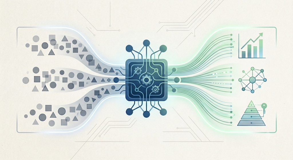
TL;DR Large sets of diverse data present several challenges for clustering, but through a novel approach that combines dimensionality reduction, recursion, and supervised machine learning, we’ve been able to obtain strong results. Using part of the algorithm, we’re able to obtain a greater understanding of why these clusters exist, allowing user-researchers and data scientists to refine, improve, and iterate faster on the issue they’re trying to solve. The cherry on top is that by doing this, we end up having an explainability layer to validate our findings, which in turn allows our user-researchers and data scientists to go deeper.
The problem
Understanding our users is very important to us — one way to understand them better is to look at their usage behavior and identify similarities, forming clusters. And this is not an easy task. What data should we use? What algorithm? How do we provide value?
There are many established ways of clustering data, — e.g., principal component analysis (PCA) and k-means — but we needed a way that could both enable us to find significant clusters and also explain why those clusters exist, allowing us to cater to specific groups of users. So we looked to develop a new approach.
So much data, so many algorithms, so few answers
When trying to answer questions related to users, the data might come from unfamiliar sources that are loosely defined and that need careful treatment (e.g., the first time we get responses from a survey, new data endpoints, preprocessed data, etc.). In the back of your mind, you can hear a little data scientist asking questions:
What is the exact definition of each answer?
Is the distribution of this sample right?
A thousa- … how many columns did you say?!
Trying classical approaches to these questions can lead to hundreds of tables of summaries, methods that don’t work at scale, and most importantly, no way of explaining our analyses.
So we embarked on a different quest to help our data scientists solve, first and foremost, the more general problem of clustering at scale, then validating and communicating their results. We ultimately landed on four steps to address these challenges:
Make the data manageable.
Cluster it.
Understand it (and predict it).
Communicate it.
The approach
1. Make the data manageable.
In order to make data easier to handle, we usually try to visualize it. However, thousands of variables are kind of hard to see. So we use some form of dimensionality reduction.
And here is when we first hit a wall. Our data looked like a blob. Round. And blobby. So what to do?
For much of this section, I will illustrate our solution to the problem with the MNIST (or Modified National Institute of Standards and Technology) dataset. MNIST has 784 dimensions to represent the written digits 0 to 9.
In data science 101, you equate dimensionality reduction with PCA. And here’s what it looks like when applied to MNIST:

Figure 1: PCA projection of the first 10,000 handwritten digits in the MNIST dataset.
You see what I mean? Round. And blobby. Remove all color representing ground truth, and it becomes even more difficult to decipher. And in real life, we don’t know what or if clusters even exist!
The main issue is that by having so many dimensions, all the data lives “at the edge”, aka “the curse of dimensionality”.
Luckily for us, in the past few years, there have been great advances in this area. Those advances make this curse less relevant. We tried a few of these new strategies, but the one we settled upon is UMAP (or uniform manifold approximation and projection, here). I will show you why, using the same data as before:

Figure 2: UMAP of the first 10,000 handwritten digits in the MNIST dataset.
Not blobby. Not round. There’s actually some structure in there!
So now we are done with Step 1. The answer is, use UMAP.
2. Cluster it
Now our data is less blobby, looks nice(r), and is more manageable. It’s time to start finding groups of points and labeling them. It’s time to start clustering. But what does it mean to cluster? What makes clustering good? Here’s what we think:
A point belongs to a cluster if the cluster exists.
If you need parameters for your clustering, make them intuitive.
Clusters should be stable, even when changing the order of the data or the starting conditions.
You know which algorithm does not meet these three criteria? Data science 101 favorite k-means.
Let me show you, once again, with Figure 2 above from UMAP. I ran k-means with k=6. Because in Figure 2, there are six clearly defined groups of points (or clusters), right?
Something similar to the following:

Figure 3: Intuitively aggregating UMAP into six clusters.
However, k-means does this!?

Figure 4: Result of running k-means on UMAP expecting six clusters.
Here’s what the data scientist in the back of your head is doing when looking at the picture above:
(╯°□°)╯︵ ┻━┻
There is, however, an algorithm that meets the criteria above, and that solves the problem really well, HDBSCAN (or hierarchical density-based spatial clustering of applications with noise). Here’s the comparison:

Figure 5: Result of running HDBSCAN with the minimum points parameter set to 500.
Your data scientist can put the table down now …
┬─┬ノ( º _ ºノ)
So it seems we have found a good companion for UMAP, although alternatives exist, like Gaussian mixture models or Genie clustering. But still, some of the clusters clearly have some internal structure.
And here is when we completely went off track. What if we zoom in? How do we zoom in? What does it mean to zoom in? When do we zoom in?
Recursive clustering and embedding, aka zooming in
Answering the questions above required adding complexity to the algorithm.
UMAP is an algorithm that tries to maintain local and global structure of the data when doing dimensionality reduction. We thought that by restricting ourselves to only one of the clusters, we could somehow change what “global” and “local” meant for that particular bit of data.
This is our idea of zooming in: Choose one of the clusters, keep only the original data points belonging to the cluster, and repeat the process only for it.
Maybe it’s easier to see with an example. Take, for instance, the yellow cluster in the middle of Figure 5 above. We isolate the data points belonging to this cluster, and we run UMAP and HDBSCAN on them.

Figure 6: Recursively clustering UMAP applied on the yellow cluster in Figure 5 above.
Eureka!
It is now clear that this middle cluster actually had three “subclusters”, each representing a nuanced vision of the original data. In this case, they’re handwritten digits. So let’s look at the average image represented by each subcluster.

Figure 7: Average reconstructed image of each cluster in Figure 6 above.
Fascinating! The digits 8, 3, and 5 all have something in common. They have three horizontal sections joined by semicircles. How those semicircles are drawn differentiates them. And this clearer understanding only appears when zooming in.
What’s even more fascinating is that we can do it for all the clusters in the original picture, even those that seem not to have any structure at all. Like the rightmost one, the blue circle.
Here’s blue circle + UMAP + HDBSCAN + average image:

Figure 8: Average reconstructed image in the five clusters found by applying recursive UMAP on the blue custer in Figure 5 above.
It’s a population of zeros, separated by how round and how slanted they’re drawn.
One important thing to notice, however, is that this process is potentially time-consuming. Also, you need to establish how deep you want to zoom in at the beginning. Do you really want to zoom in on a cluster of just 1% of your data? That’s up to you and what you want to achieve.
3. Understand it (and predict it)
So far, we’ve been able to make our data manageable, and we also found some clusters. We exploited the algorithms’ abilities to find finer structure too. But in order to do this, we repeatedly ran some very complex algorithms. Understanding why the algorithms did what they did is not something any human can do easily; they are highly nonlinear processes stacked one on top of another.
But maybe some nonhuman statistical and machine learning process can make sense of it.
We have data, and through the above process, we have clusters for each data point — data and automatically generated labels. This is a typical machine learning classification problem! Luckily for us, there has been an amazing amount of development in model explainability (XAI, or explainable artificial intelligence). So what if we build a model and use XAI to understand what our UMAP + HDBSCAN + recursion is doing?
In our particular case, we decided to use XGBoost as a one-versus-all model for each cluster. This allows for very fast and accurate training, but also integrated SHAP (or Shapley additive explanations, here) values for explainability.
By looking at the SHAP summary plots, we can gather insights on the internal workings of our stacked processes. We can then deep dive into each of the important features, assess the validity of each cluster, and keep refining our understanding of our data and our users.
We can also use and deploy the model in production without the need to run UMAP and HDBSCAN again. We can now use our original data coming from our pipelines. Easy as pie, isn’t it?
4. Communicate it
Once the clusters are well established, we can then look at other sources of data, like demographics, on platform usage, etc., to further fine-tune our understanding of who the users are. This will oftentimes involve further work from user research, market research, and data science.
But in the end, you will obtain some very solid evidence about each cluster.
Think about a presentation deck that shows the following:
You have some data-driven, well-informed, thoroughly researched clusters of population.
You have your SHAP charts that show why the model is choosing to put a user in a certain cluster.
You have further finely tuned research of those users, driven by the original data and augmented with targeted user and market research. Each with its own slide.
You know how important each cluster is in the population.
You can also look at other questions, outside the scope of the original investigation, and answer them cluster by cluster. Perhaps there’s a portion of the population that will accept a certain feature more readily than others?
Conclusion and further work
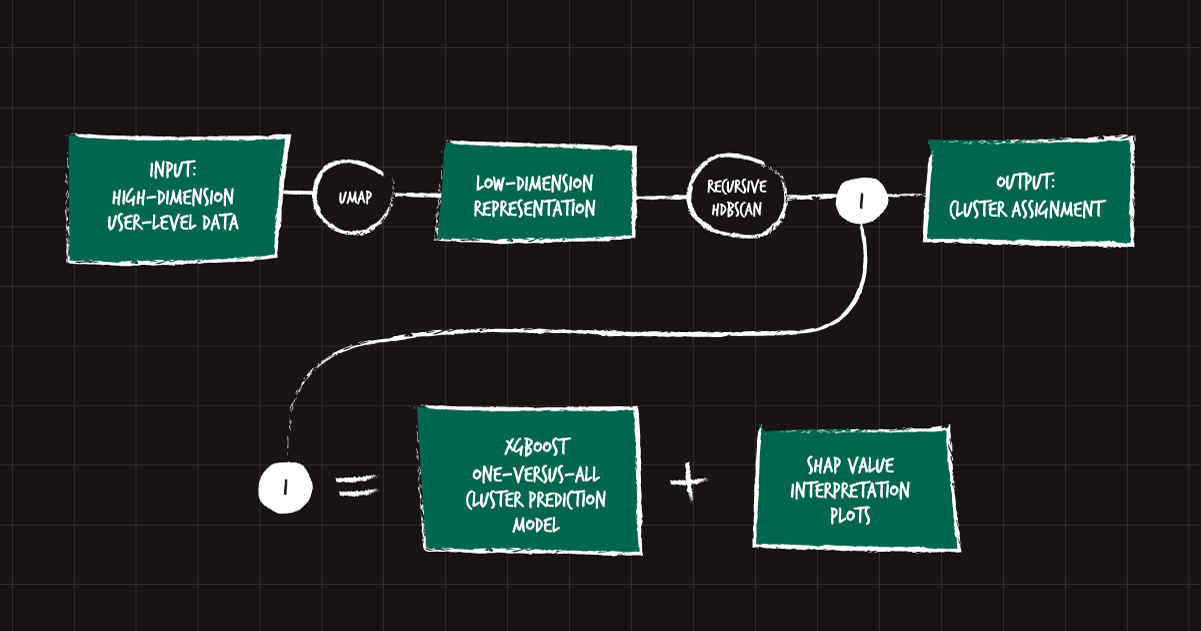
To recap the process, here is a diagram:

Figure 9: Diagram representing the complete recursive embedding and clustering process.
This process consists of some clearly defined steps, most of them used before. However, our main contribution in this process is the novel idea of recursing (zooming in) and building an interpretability layer. This allows for a finer, deeper understanding of our users from the start. In turn, better information allows for more targeted research into each of the data-driven, but also qualitatively assessed, user groups, ultimately leading to the development of better products and experiences for all users.
As for further development, we believe there are opportunities to make the process even more stable and robust, so we can be more confident in each of the clusters, speeding up the discovery process. We are currently working on this. Expect more!
SHARE THIS ARTICLE